Best of Data & Data Viz Twitter - Week of March 14, 2022
✌️
Hi!
Here is the best of Data & Data Viz Twitter of this week:

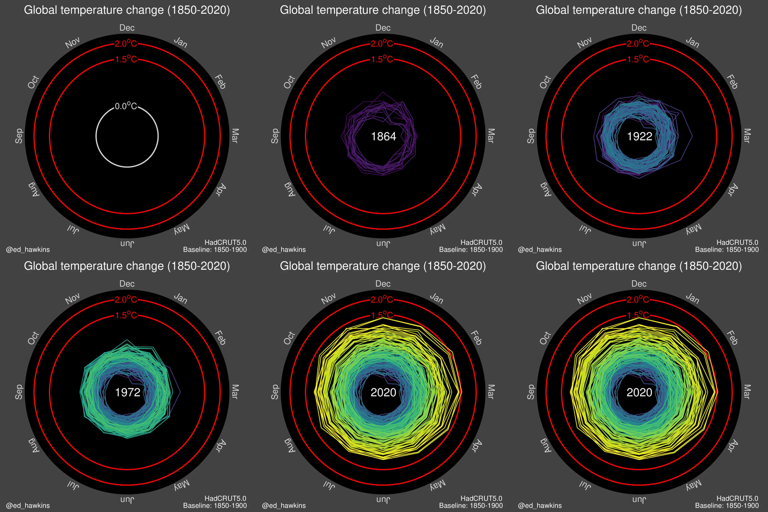
The climate spiral a real nice visualization designed by climate scientist @ed_hawkins from the National Centre for Atmospheric Science, University of Reading. #dataviz


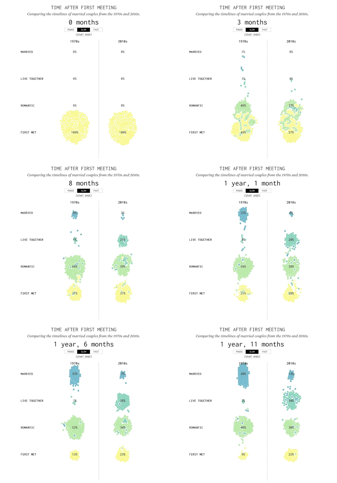
A survey of 1000 Americana visualized.
A Day in the Life of Americans | FlowingData
buff.ly/2ojR9NE
#blockchain #cryptocurrency #crypto #DataScience #data #datavisulization #visualization #machinelearning #ML #DataScientist #datamining

You are in the green part - all your ancestors lie below. Amazing to read, think of where we are in human history.
bit.ly/3teCPXN @OurWorldInData


In recent history, there have almost always been more new babies than people dying, but 2020 was different flowingdata.com/2022/02/03/whe…

What happened in the world recently…

Is support for Vladimir Putin waning? The outcome of the war depends on the mood in Moscow as well as the fighting near Kyiv


From price surges to panic buying, tough sanctions by the west have sparked fears of shortages and soaring costs for critical products in Russia

We have insights from our colleague, Alexander Junke (Data Engineer, datadice GmbH) to help us to understand what’s behind the scene of Google Analytics announcement. Read here: The end of Google’s Universal Analytics has a date.
Google: We’ll begin sunsetting Universal Analytics next year.

Two and a half years ago, we introduced Google Analytics 4 to address evolving measurement standards and help businesses succeed. Today, we’re announcing that we’ll begin sunsetting Universal Analytics next year.
Learn more about what to expect → goo.gle/3MPcUh3


Introducing the new Google Analytics, designed to help you get the essential insights you need to be ready for what's next. Read the announcement → goo.gle/3nXifXh


