datadice | Best of Twitter

Share this post

Best of Data & Data Viz Twitter - Week of February 27, 2023

datadicebestoftwitter.substack.com

Best of Data & Data Viz Twitter - Week of February 27, 2023

🍄

datadice.bestoftwitter
Mar 3
2
Share this post

Best of Data & Data Viz Twitter - Week of February 27, 2023

datadicebestoftwitter.substack.com

Hello everyone,

This is Ying from datadice. Here are this week's most interesting tweets, which include the topics:

  • Mobile phones market has evolved over 30 years

  • Violin charts interactive

  • F1 Data Analysis

  • Average Monthly Salary - Iberoamerican territories 2022

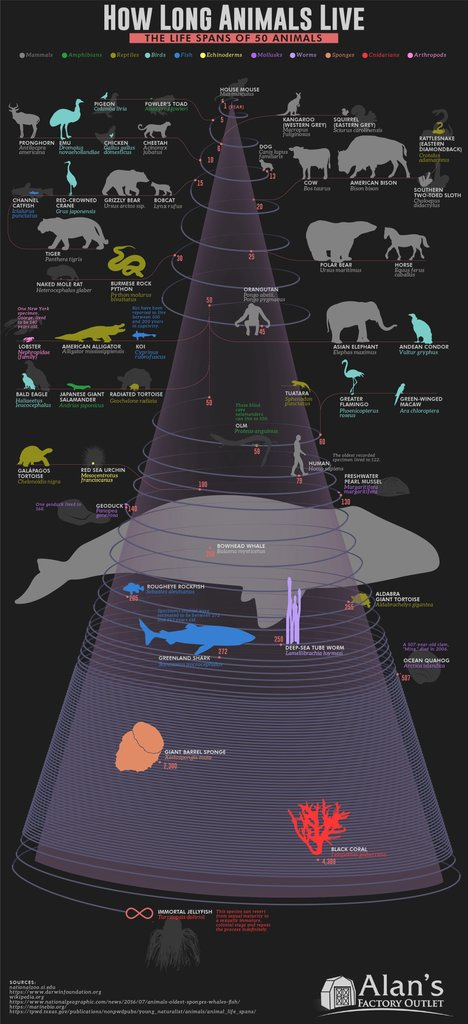
  • The Life Expectancy of Humans and 49 Other Animals

  • Fossil Fuels Since the Invasion

  • A summary stacked barplot of the sentiment analysis for 14 African languages

  • A year of reading

Enjoy your reading and share your thoughts with us!

Twitter avatar for @IanLJones98
Ian Jones @IanLJones98
How the mobile phones market has evolved over 30 years📲 ~ another great video graphic by @JamesEagle17 v/@VisualCap cc @BetaMoroney @enilev @tobiaskintzel @sallyeaves @Nicochan33 @jeancayeux @AkwyZ @Khulood_Almani @mikeflache @JagersbergKnut @sonu_monika
9:21 PM ∙ Mar 1, 2023
46Likes30Retweets
Twitter avatar for @echarty_R
echarty @echarty_R
📊🎻 Violin charts interactive Groups, customizable (data points, mean, color, tooltip, etc.) 🔗 helgasoft.github.io/echarty/galler… #rstats #dataviz #datascience #datavisualization
6:16 PM ∙ Mar 1, 2023
20Likes5Retweets
Twitter avatar for @F1DataAnalysis
F1 Data Analysis 📈 @F1DataAnalysis
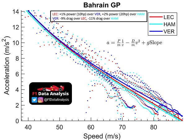
During last year's quali, the engine pecking order was: 1)Ferrari: around +20hp over Merc 2)RB: around +10hp over Merc 3)Merc The drag levels were: 1)RB: ~11% LESS drag than the Merc 2)Ferrari: ~2% LESS drag than the Merc How did I estimate that? Read on to know👇 #F1
Image
2:49 PM ∙ Mar 2, 2023
1,375Likes59Retweets
Twitter avatar for @DatavizAdventuR
Dataviz Adventure @DatavizAdventuR
Hi #datafam, I'm still exploring #dataviz animations with After Effects...uffff I'm gonna practice much more! Here something that I made early today. "Average Monthly Salary - Iberoamerican territories 2022". . . . . #DataVisualization #LATAM #Learning #Salary #animation
12:40 AM ∙ Feb 25, 2023
24Likes2Retweets
Twitter avatar for @VisualCap
Visual Capitalist @VisualCap
Ranked: The Life Expectancy of Humans and 49 Other Animals 🐣 visualcapitalist.com/ranked-the-lif…
Image
7:00 AM ∙ Mar 3, 2023
91Likes22Retweets
Twitter avatar for @VCElements
Elements @VCElements
Russian fossil fuel exports are still flowing to various nations around the world 🌏️ We've visualized the countries that have bought the most Russian fossil fuels since the invasion, showcasing the billions in revenue Russia has made from these exports: elements.visualcapitalist.com/the-countries-…
Image
6:02 PM ∙ Mar 2, 2023
77Likes41Retweets
Twitter avatar for @npechl
Nikolaos Pechlivanis @npechl
For this week's #TidyTuesday challenge, I created a summary stacked barplot of the sentiment analysis for 14 African languages. R code: github.com/npechl/TidyTue… Source: AfriSenti #rstats #dataviz
Image
6:27 PM ∙ Mar 2, 2023
16Likes6Retweets
Twitter avatar for @datavizjenn
Jenn Schilling @datavizjenn
My book stack #DataViz for 2022. I read 117 books in 2022, totaling 36,472 pages. 77% of the books I read were written by female authors. I created this visualization in #RStats. Resources for learning R: schillingdatastudio.com/blog CSV with the books: bit.ly/3S1pywd
Most of the image is a 12-month stacked bar graph. Each stack of books shows what I read in the month. In the first half of the year,  I read the most in May and the least in March. In the second half of  the year, I read more, and I read the most in December and the least in July.
1:53 PM ∙ Feb 28, 2023
137Likes13Retweets

Thank you for taking the time to read our Newsletter and happy weekend!


More about datadice:
☛datadice Official Website
☛LinkedIn | datadice GmbH
☛datadice Blog Articles
🔝The Next Power BI Guide with DAX formulas and date tables-Step-by-Step instructions for advanced data transformations. By Sanyukta Suman
🎥Youtube:
►Short: Looker Studio Tip#1: Country Flags in Tables
📣More from YouTube Channel:
▪︎ Intro | Datrehousing 101
▪︎ Data Studio Practices
▪︎ Bi

Thanks for reading datadice | Best of Twitter! Subscribe for free to receive new posts and support our work.

gQuery
Share this post

Best of Data & Data Viz Twitter - Week of February 27, 2023

datadicebestoftwitter.substack.com
Comments
TopNew

No posts

Ready for more?

© 2023 datadice.bestoftwitter
Privacy ∙ Terms ∙ Collection notice
Start WritingGet the app
Substack is the home for great writing