datadice | Best of Twitter

Share this post
Best of Data & Data Viz Twitter - Week of November 28, 2022
datadicebestoftwitter.substack.com

Best of Data & Data Viz Twitter - Week of November 28, 2022

⚽️

datadice.bestoftwitter
Dec 2, 2022
3
Share this post
Best of Data & Data Viz Twitter - Week of November 28, 2022
datadicebestoftwitter.substack.com

Hello everyone,

This is Ying from datadice. Here are this week's most interesting tweets, which include the topics:

  • Noise Pollution in London

  • Employment Densities

  • Racial Breakdown of Musicians in America

  • Move Like Jaguar

  • 30 Days Mapping Challenge

  • FIFA World Cup

  • 90% of Data Scientists Struggle with forecasting

  • Ocean Depth in Antarctica

Enjoy your reading and share your thoughts with us!

Twitter avatar for @malasi_abhinav
Abhinav Malasi @malasi_abhinav
#30DayMapChallenge | Day 27 | Music Noise pollution in London Code: github.com/amalasi2418/30… #RStats #dataviz #DataVisualization #London #noisepollution
Image
3:54 PM ∙ Nov 27, 2022
36Likes7Retweets
Twitter avatar for @oh_sk
Stephen Kennedy @oh_sk
#30DayMapChallenge Day 28 3D: Employment Densities Coming in at the last minute after a lot of wrestling with #blender3d (first time!)... not exactly where I hoped to get stylistically, but calling it done for now! Employment estimates by category from @UFPlatform #gischat
Map of Madison WI area with employment categories extruded in 3D to show higher and lower densities.
5:23 AM ∙ Nov 29, 2022
47Likes6Retweets
Twitter avatar for @imagineazhar
Muhammad Azhar @imagineazhar
Hey #datafam Submission for Day 27 of #30DayMapChallenge Viz: public.tableau.com/app/profile/m.… #music #map
Image
12:25 PM ∙ Nov 27, 2022
85Likes9Retweets
Twitter avatar for @fblpalmeira
Francesca Palmeira🌴 @fblpalmeira
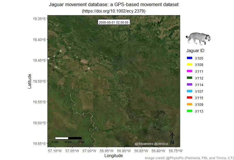
#30DayMapChallenge - Day 23: Movement | Moves Like Jaguar: An animation showing the movement of nine individuals of jaguar in the Brazilian Pantanal wetland. 🔗R code: github.com/fblpalmeira/mo…
Image
8:55 PM ∙ Nov 23, 2022
49Likes15Retweets
Twitter avatar for @DevinMLea
Devin Lea @DevinMLea
#30DayMapChallenge Day 29: Out of My Comfort Zone Feeling meta as we approach the end of the challenge and had never made a Sankey Diagram, so I followed in footsteps of @helenmakesmaps day 30 from 2021 and 'mapped' the tools I used by day and effort for this challenge
The diagram shows each day on the left side and the various methods Devin used to create maps on the right side. For each day, one or more lines connect the individual day on the left side with the methods on the right side depending on the amount of time each tool was used. For example, on day 1, if 50 percent of the time was spent using QGIS and 50 percent spent using Adobe Illustrator, the full line is evenly split so half goes to QGIS and half goes to Adobe Illustrator.
8:18 PM ∙ Nov 29, 2022
33Likes4Retweets
Twitter avatar for @jaanekaraster
Jacob @jaanekaraster
#30DayMapChallenge Day 22: NULL A simple R map of "terra nullius", or a land that no one technically owns (yet)--Antarctica. #ggplot2 #RStats #ggoceanmaps
Image
9:37 AM ∙ Dec 2, 2022
2Likes2Retweets
Twitter avatar for @danoehm
Dan Oehm 🌲⛰️ @danoehm
#TidyTuesday week 48: FIFA World Cup ⚽️ Mean difference in scores for home and away games for the 20 countries with the most games played since 1990. Belgium, Sweden, and Argentina tend to win more games at home suggesting a possible home-ground advantage #RStats #dataviz
Image
3:49 AM ∙ Dec 2, 2022
20Likes4Retweets
Twitter avatar for @mdancho84
Matt Dancho (Business Science) @mdancho84
90% of data scientists struggle with forecasting. So I made an article to help. This tutorial will get you started in under 5 minutes. Learn more: bit.ly/3uiFZsV #rstats #datascience #excel #python #sql
Image
1:37 PM ∙ Dec 1, 2022
624Likes158Retweets

Thank you for taking the time to read our Newsletter! See you next week!


More about datadice:
☛datadice Official Website
☛LinkedIn | datadice GmbH
☛datadice Blog Articles
🎥Youtube:
►Google Analytics - GA4 vs. UA #1 - Frontend, Data Structure, Bounce Rate
►Google Analytics - GA4 vs. UA #2 - Customizations, Sharing, BigQuery Export
📣More from YouTube Channel:
▪︎ Intro | Datrehousing 101
▪︎ Data Studio Practices
▪︎ BigQuery

Thanks for reading datadice | Best of Twitter! Subscribe for free to receive new posts and support our work.

Share this post
Best of Data & Data Viz Twitter - Week of November 28, 2022
datadicebestoftwitter.substack.com
Comments
TopNew

No posts

Ready for more?

© 2023 datadice.bestoftwitter
Privacy ∙ Terms ∙ Collection notice
Start WritingGet the app
Substack is the home for great writing