datadice | Best of Twitter

Share this post
Best of Data & Data Viz Twitter - Week of January 09, 2023
datadicebestoftwitter.substack.com

Best of Data & Data Viz Twitter - Week of January 09, 2023

šŸ§‹

datadice.bestoftwitter
Jan 13
4
Share this post
Best of Data & Data Viz Twitter - Week of January 09, 2023
datadicebestoftwitter.substack.com

Hello everyone,

This is Ying from datadice. Here are this week's most interesting tweets, which include the topics:

  • Bubble tea combinations, a visual breakdown

  • Lollipops Chart šŸ­

  • ggplot() + geom_birds(🦜)

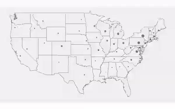
  • Population Density Map in Canada.

  • Brits Want To See More Migrant Doctors & Nurses

  • Environmental Taxes

  • America Runs on Bottled Water

  • Why Does My Dog…

Enjoy your reading and share your thoughts with us!

Twitter avatar for @samuel_wong_
Samuel Wong @samuel_wong_
Bubble tea combinations, a visual breakdown
flowingdata.comBubble tea combinations, a visual breakdownWalk into a boba shop and usually you’ll see a large menu that lists the options for your tea, milk, toppings, ice, and sweetness. With all the variations, you get a lot of combinations. Juli…
1:12 AM āˆ™ Feb 13, 2022
37Likes8Retweets
Twitter avatar for @AMarciaBarbosa
A. MƔrcia Barbosa @AMarciaBarbosa
Lollipops, anyone? modtools.wordpress.com/2023/01/05/lol… #RStats #DataVisualization #dataviz
modtools.wordpress.comLollipop chartAccording to modern recommendations in data viz, lollipop charts are generally a better alternative to bar charts, as they reduce the visual distortion caused by the length of the bars, making it e…
4:37 PM āˆ™ Jan 5, 2023
17Likes6Retweets
Twitter avatar for @FilmicAesthetic
Dan @FilmicAesthetic
ggplot() + geom_birds(🐦) Unfortunately, I don't think I'm going to invest the time to finish what I was hoping to achieve on this week's #TidyTuesday visual, but I learned a lot about gganimate and still wanted to share! Code: github.com/filmicaestheti… #rstats #dataviz
Image
9:00 PM āˆ™ Jan 12, 2023
23Likes5Retweets
Twitter avatar for @researchremora
terence fosstodon @researchremora
Today's population density map is Canada. #rayshader adventures, an #rstats tale
A population density map of Canada
9:24 PM āˆ™ Jan 11, 2023
3,322Likes548Retweets
Twitter avatar for @StatistaCharts
Statista @StatistaCharts
In a separate Ipsos poll, researchers found that #immigration fluctuated in terms of whether it was considered an ā€œimportant issueā€ for #UK voters in recent months, hitting 11 percent in October, 21 percent in November and 15 percent in December.
Image
4:20 PM āˆ™ Jan 12, 2023
26Likes9Retweets
Twitter avatar for @fedfragapane
Federica Fragapane @fedfragapane
Thank you @Behance for featuring my #datavisualization on environmental taxes in your gallery behance.net/gallery/159028…. Project designed for @La_Lettura #dataviz #infographic #ddj #graphicdesign
The data visualization on environmental taxes: the project shows tax revenues from environmental taxes, calculated as a percentage of total tax revenues, from 2000 to 2020 for 20 countries.
The countries indicated are the top 20 ones by GDP in 2021, selected from those with data on environmental taxes available from 2000 to 2020. 
The visualization shows 20 long shapes - each one representing a country - made of 21 ā€œhillsā€, one for each year. Some of the hills are darker and points to the left side, some of them are lighter and pointing to the right.  The length of each hill is proportional to the data on environmental taxes and direction and color show an increase or decrease over the previous year.
Source Source: data.oecd.org
2:01 PM āˆ™ Jan 12, 2023
23Likes4Retweets
Twitter avatar for @StatistaCharts
Statista @StatistaCharts
The most popular drink in the U.S. is sold at a 4000% markup and is responsible for tens of millions of discarded containers each day: bottled water. Despite U.S. tap water - with some notable exceptions - being safe to drink, around 1/3 of Americans don't consume it at all.
Image
10:32 AM āˆ™ Jan 13, 2023
37Likes11Retweets
Twitter avatar for @tableaupublic
Tableau Public @tableaupublic
In this #IronQuest #VizOfTheDay, Tableau Public Ambassador and 2022 Iron Viz Champion @WJSutton12 visualizes Google search autocomplete data from 2022 to analyze the most common questions for 60 popular dog breeds. tabsoft.co/3k5Vdjf
Image
6:00 PM āˆ™ Jan 12, 2023
105Likes6Retweets

Thank you for taking the time to read our Newsletter and happy holidays! šŸŽ…


More about datadice:
ā˜›datadice Official Website
ā˜›LinkedIn | datadice GmbH
ā˜›datadice Blog Articles
šŸ”Latest Updates on Google Data Analytics (December 2022)-The highlights of the updates on BigQuery, Looker Studio, Google Analytics (GA) & Google Tag Manager (GTM). By Alexander Junke
šŸŽ„Youtube:
ā–ŗ Data Warehousing 101 - Starting a new dashboard project
šŸ“£More from YouTube Channel:
ā–ŖļøŽ Intro | Datrehousing 101
ā–ŖļøŽ Data Studio Practices
ā–ŖļøŽ BigQuery

Thanks for reading datadice | Best of Twitter! Subscribe for free to receive new posts and support our work.

Share this post
Best of Data & Data Viz Twitter - Week of January 09, 2023
datadicebestoftwitter.substack.com
Comments
TopNew

No posts

Ready for more?

Ā© 2023 datadice.bestoftwitter
Privacy āˆ™ Terms āˆ™ Collection notice
Start WritingGet the app
SubstackĀ is the home for great writing